
Building an Onboarding and Registration UI in .NET MAUI

See how to use LinearGradientBrush and RadialGradientBrush, structure grid layouts and create a dynamic form using the Telerik DataForm in .NET MAUI.
Have you ever seen apps with super fresh screens with gradients that make you think: “OMG, where do I get that image to use as a background in my apps?” 👀
Well, today you won’t just see a UI like that … you’ll learn how to create it from scratch. This UI is inspired by a design from Dribbble, and we’ll recreate it step by step.
Here’s where it gets interesting: we’ll build that super modern gradient using LinearGradientBrush in .NET MAUI, without relying on external images, achieving that clean look directly from code.
From there, we’ll put together the entire experience: an onboarding screen with a clean and modern design, along with a registration form using the Progress Telerik UI for .NET MAUI DataForm.
The best part is that you’ll understand every step of the process, from the background gradient to the structure of the form and how to use the components, so you can easily adapt it to your own projects.
So let’s get started, and you’ll see how simple and fast it’s to build a UI like this. 🚀
How Will the Explanation Work?
So you can understand everything 100%, I’ll explain how the process will work:
➖ Visual diagram: Before we start, you’ll see a diagram with a screenshot of the design we want to achieve. This design will be divided into screens, each identified with a name and a color. Each one will be explained individually.
➖ Code explanation per block: In addition to the written explanation, each screen includes a set of blocks with the exact code snippets you need to implement and achieve the final result.
➖ Step-by-step visual progress: Each explanation will have its corresponding screenshot, so you can see the progress as we build the UI.
⚠️ For this design, we took inspiration from an original Dribbble UI, but made some adaptations and adjustments to align it with the goals of this article.
🔧 Environment Setup
You’ll learn how to take advantage of some of the powerful Telerik UI for .NET MAUI components in this post. If you don’t have the .NET MAUI library installed yet, visit the quick start page, which explains step-by-step how to install Telerik UI for .NET MAUI, download the license key, configure the Telerik package source and install the Telerik MCP server (if needed).
Breaking Down the Design
To make this easier to follow, I’ve divided the design into clear blocks. We’ll build each part one at a time, in the order you see below.

1. Onboarding
Oh yeahh! We’ve reached the first screen! 😎 This is an onboarding screen, and I really like it because it’s perfect for practicing XAML while building a modern UI.
One of the highlights here is the gradient background. When we see something like this, it’s easy to think we need an image to achieve it, but that’s not the case. We’ll build it from scratch using LinearGradientBrush from .NET MAUI, giving you full control to customize and experiment with gradients directly from code, without relying on external assets.
On top of that, this screen helps us structure a real layout by combining key UI elements: a centered image, a title with a description, and simple actions like a button and a “Skip” option.
Adding the Gradient
To get started with the code, the first thing we’ll create is the gradient that will be used as the background for the entire page. We’ll assign it directly as the background of the ContentPage.
Using LinearGradientBrush, add the following code block right before defining the main layout. Keep in mind that you can tweak each variation of the gradient using GradientStop.
✍️ If you want to learn more about LinearGradientBrush, I recommend checking out the MS Learn article.
Main Layout
Now let’s continue with one of the most important components in a .xaml file: the main layout. For this screen, we’ll add a Grid with two columns and five rows:
Keep in mind that this Grid will contain all the elements of your page, so it should be placed inside the ContentPage, exactly where the previous code block says: “Add your Grid here.”
The Halo
As you may notice, the main image has a kind of “halo” behind it, almost like a soft circle. In this case, we enhanced that effect using a RadialGradientBrush. 😎
This code block should be placed right at the beginning of the Grid, before adding the image and the rest of the elements.
✍️ If you want to learn more about RadialGradientBrush, check out the MS Learn article.
Main Images, Labels and Button
Now we’ll continue by adding the remaining elements of the screen: the main image, labels and the button.
Once the layout and components are in place, the result should look like this:

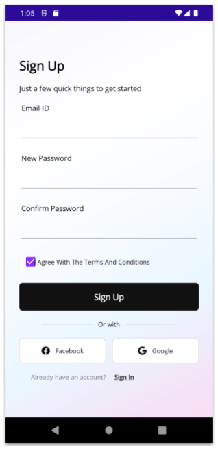
2. Sign Up
For our second screen, we’ll also add a gradient. As you can see, it’s not exactly the same as the one on the previous screen, so we’ll create a new one with different color variations, applying it in the same way we did before, directly in the ContentPage.
Main Layout of Sign Up
Just like in the previous page, we’ll use a Grid. In this case, it will have eight rows and two columns. Inside this Grid, we’ll add all the remaining elements.
Title & Description
Let’s Add the Form!
One of my favorite moments has arrived 😍 (because yes, I absolutely love this component). For our form, we’ll use the Telerik UI for .NET MAUI DataForm!
To use it, don’t forget to follow the instructions in the “🔧 Environment Setup” section explained earlier. Additionally, you’ll just need to add the following namespace to your XAML:
xmlns:telerik="clr-namespace:Telerik.Maui.Controls;assembly=Telerik.Maui.Controls"
Creating the Model
To display the fields in our form, we’ll create a model where we define everything we need, such as the email and password. This is also where we specify whether each field is required, its display name and the data type.
The data type is especially important, for example, for password fields. It masks the input, showing *** as you type.
Additionally, the Telerik DataForm uses these attributes to automatically generate and validate the UI, which means we don’t need to manually create each input field or handle basic validation logic.
Our model should look like this:
public class SignUp : NotifyPropertyChangedBase
{
    private string email;
    private string password;
    private string confirmPassword;

    [Required]
    [Display(Name = "Email ID")]
    public string Email
    {
	    get => email;
	    set => UpdateValue(ref email, value);
    }

    [Required]
    [Display(Name = "New Password")]
    [DataType(DataType.Password)]

    public string Password
    {
	    get => password;
	    set => UpdateValue(ref password, value);
    }

    [Required]
    [Display(Name = "Confirm Password")]
    [DataType(DataType.Password)]

    public string ConfirmPassword
    {
	    get => confirmPassword;
	    set => UpdateValue(ref confirmPassword, value);
    }
}
Now, go to your XAML page and set the BindingContext from the code-behind. For this article, we’ll keep the example simple and assign a new instance of our SignUp model directly in the page constructor:
public SignUpPage()
{
    InitializeComponent();
    this.BindingContext = new Models.SignUp();
}
This allows the DataForm to read the model properties and generate the corresponding fields based on the attributes we defined earlier.
Adding It in XAML
Finally, we can add it to our XAML. Simply include something like the following:
At this point, the DataForm will automatically generate the form fields based on the model we defined earlier.
Terms & Conditions and Button
Social Networks
Once the layout and components are in place, the result should look like this:
Conclusion
I hope this article helps you understand how to recreate a modern UI from scratch using .NET MAUI. 😎 From building custom gradients with LinearGradientBrush and RadialGradientBrush, to structuring layouts with Grid, and creating a dynamic form using the Telerik DataForm, you now have a solid foundation to build clean and modern interfaces.
The best part is that these are concepts you can easily reuse and adapt to your own projects to create more polished and visually appealing apps. 💚
If you have any questions or would like me to dive deeper into a specific part, feel free to leave a comment. I’ll be happy to help!
See you in the next article! 🙋♀️🚀
Remember, you can try Telerik UI for .NET MAUI free for 30 days.